Take out a pen and paper, it’s time to brainstorm!
Why are you telling this story? Why is it important?
Now write that down and keep it somewhere you can see while you work on your infographic.
Think about the story first:
The goal of data visualization is to capture attention, simplify complex concepts and break up lengthy paragraphs.
Infographics are a unique form of storytelling that work particularly well with data driven stories. Do you have a great statistic that would work well in an infographic? Perfect!
- Pick a theme! It’s easy to start with one great statistic and then expand that out as a theme. I like to find at least four statistics or pieces of data to highlight in the infographic. If you have a great statistic about food miles – maybe find other stats about local foods.
- Find a way to make the stat more relatable, no one knows what 1.54 million pounds of wheat looks like, but if you say 1.54 million pounds of wheat or enough to feed x amount of people, or fill x amount of trucks, that means a lot more!
- Find at least three to four data points for the infographic.
- How do the statistics relate? Is there a linear narrative to tie the stats together?
- Make sure to keep track of your sources, you’ll need to include them in your infographic to add credibility.
The process for creating an infographic:
- Collect data and review – make sure you quadruple check everything!
- Determine key messages and wow factor facts. These will guide what type of graphic you produce and what details should be highlighted.
- How is similar data usually visualized? Everything has been done before, but that doesn’t mean it has to be done the same way again.
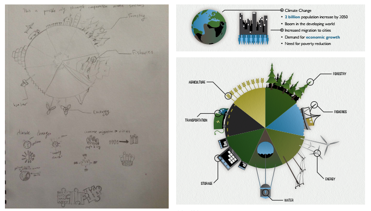
- Sloppy doodles! Drawing helps you get a feel for the visualization. Less detail makes it easier for the audience. Always draw more than three ideas!

See the full graphic here.
Many thanks to Anders Larsson who contributed heavily to this tutorial. See his work here.


